Single Project
Specialized in Web Design, UX /Ul, Webflow, and Front End Development.
- Summary
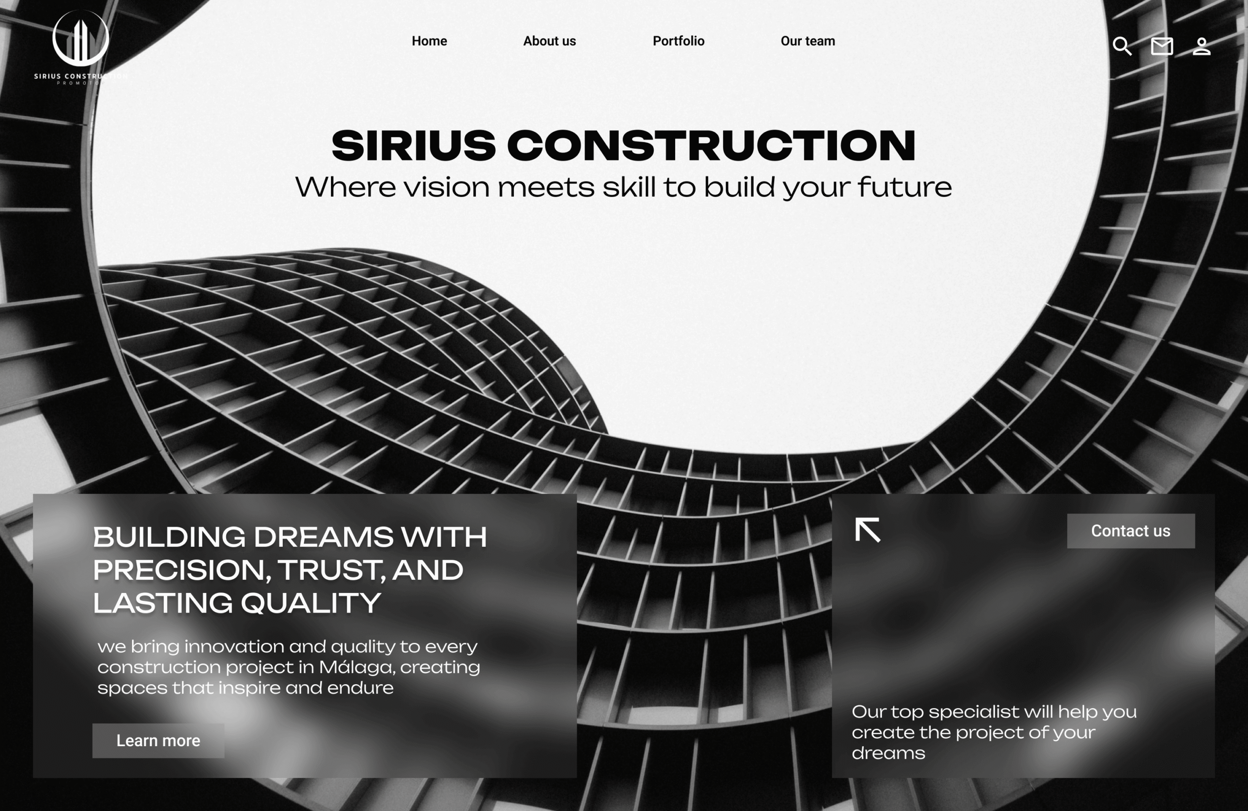
The Construction website was redesigned to overcome issues with unclear visual hierarchy and inconsistent front-end design, which previously made navigation difficult and reduced user engagement. Our team conducted a full UI/UX audit, mapped key user flows, and developed a modern, responsive layout. The solution features consistent typography, cohesive color schemes, and strategically placed calls-to-action. Interactive elements and visual cues now guide users through services, projects, and contact sections, significantly enhancing usability, engagement, and overall user satisfaction.
The construction website previously faced several challenges that negatively affected the user experience. The visual hierarchy was unclear, making it hard for visitors to distinguish between primary and secondary content. Key information about services, projects, and contact options was scattered and not prominently displayed. Additionally, inconsistent front-end elements—such as mismatched fonts, colors, and button styles—created a sense of disorganization and reduced overall credibility. Users often had difficulty navigating the site, leading to frustration and lower engagement rates.
To address these issues, our team conducted a comprehensive UI/UX audit, examining both the structure and visual presentation of the site. We mapped out all major user flows to identify pain points and prioritize content that users needed most. Wireframes and prototypes were created to test new layouts and ensure a more intuitive navigation system. Our approach emphasized responsive design, so that the website performs seamlessly on all devices, and a consistent visual language, ensuring a professional and trustworthy appearance.
The redesigned website now features a modern front-end with clear and legible typography, consistent color schemes, and cohesive visual elements throughout. Calls-to-action are strategically placed to guide users toward important sections, such as service offerings and project portfolios. Interactive elements, like hover effects and visual cues, enhance engagement without overwhelming the user. Overall, the new design improves usability, strengthens brand perception, and encourages visitors to explore the site more thoroughly, resulting in higher user satisfaction and better conversion potential.